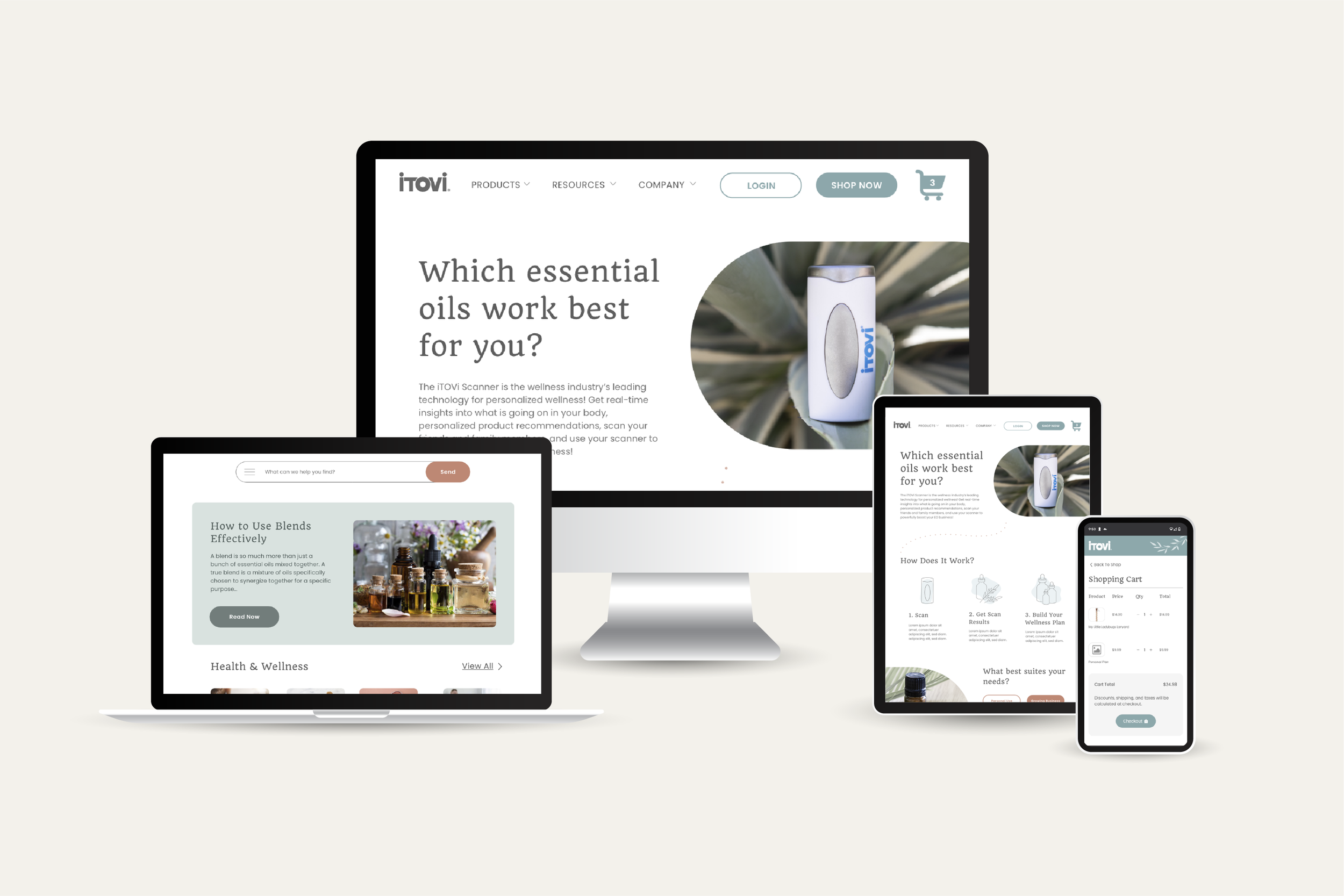
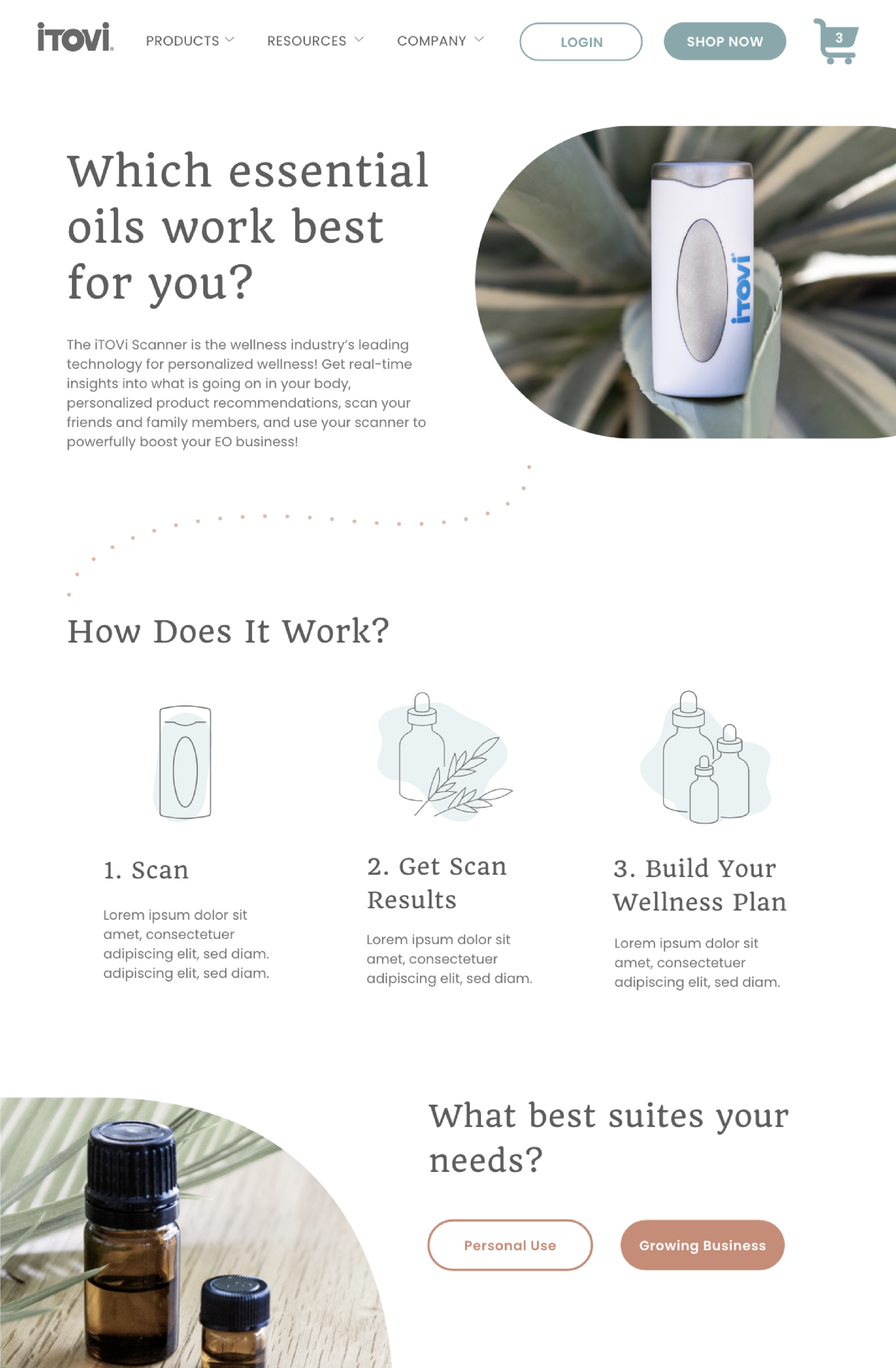
iTOVi Website & Rebrand
The Problem
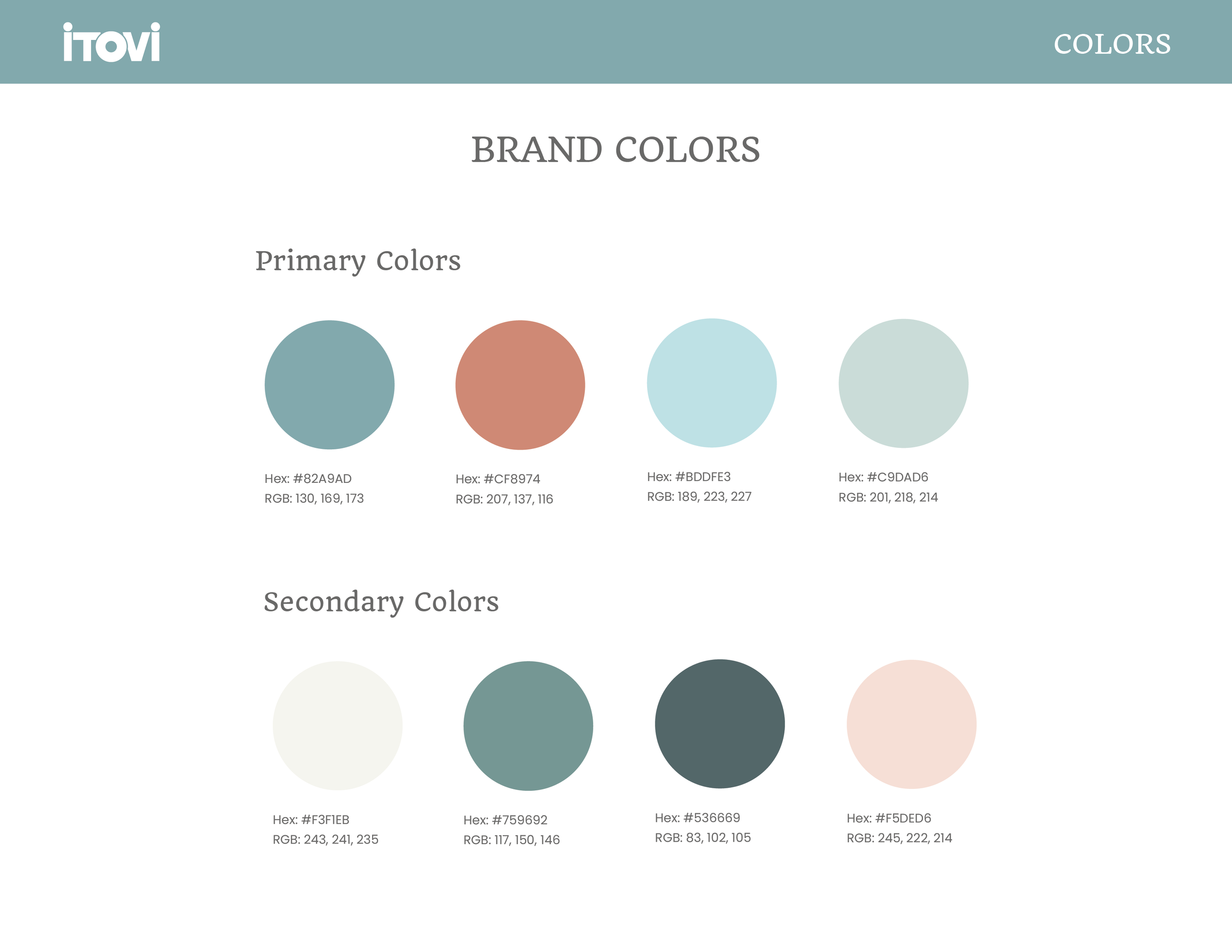
The original iTOVi brand leaned very bold across color, typography, and imagery, which didn’t reflect the health and wellness space the product lives in. As a scanner used with essential oils, the brand needed to feel more natural and grounded, with a stronger connection to wellness rather than feeling overly loud or tech-forward.
The Work
I refined the color palette, typography, and overall visual style to create a calmer, more balanced look. Botanical elements were introduced to visually connect the brand to essential oils and wellness. The website was redesigned to support the updated direction, creating a more cohesive experience that feels intentional and aligned with how the product is actually used.