TruMerit Logo Redesign & Rebrand
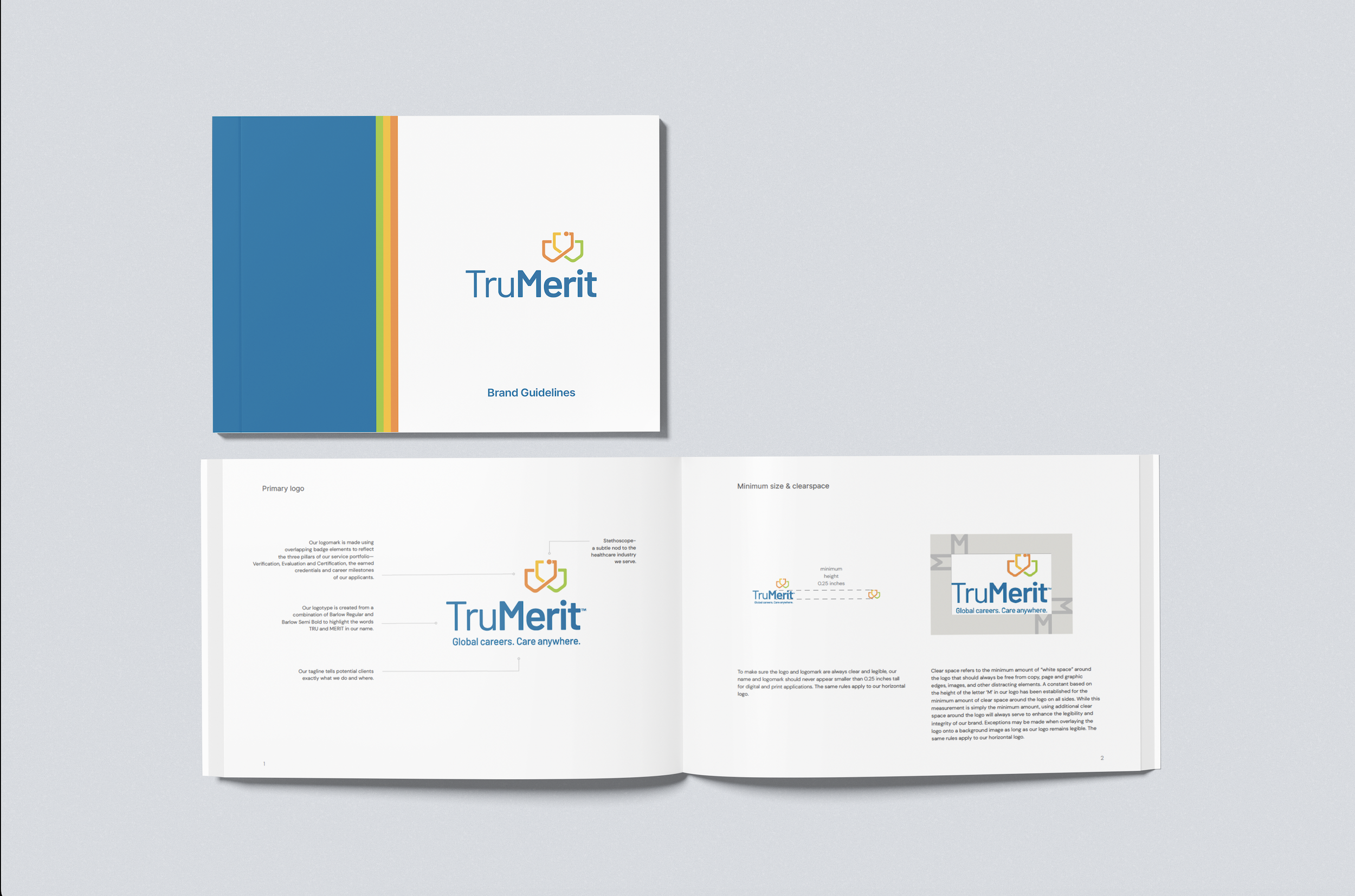
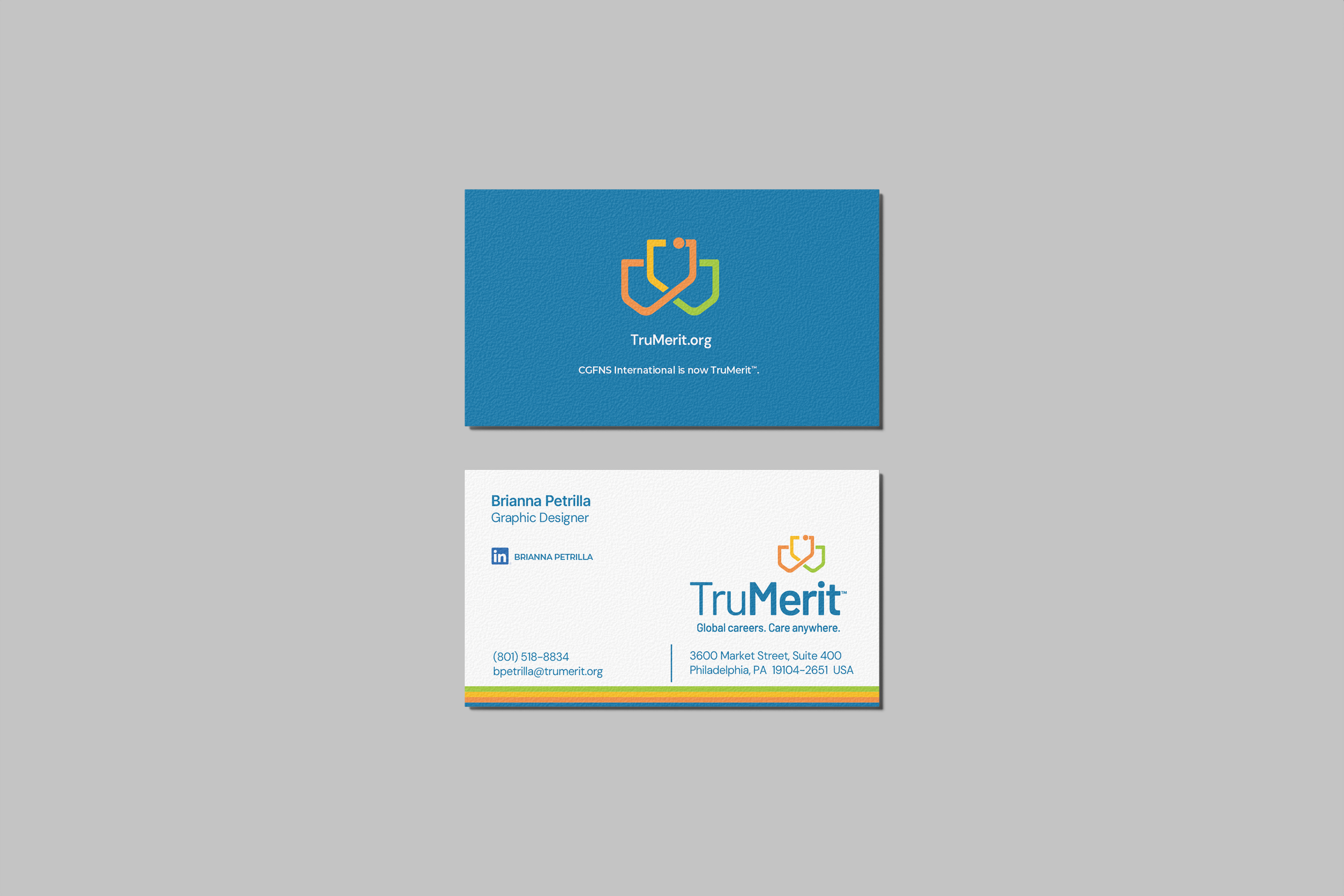
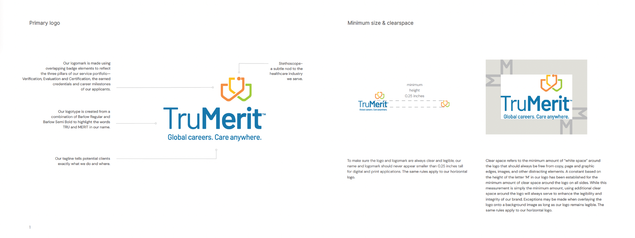
I worked on the logo and overall visual identity as part of the rebrand. The logo combines overlapping badge elements to represent TruMerit’s three core service pillars and the career milestones applicants achieve. A subtle stethoscope shape references the healthcare professionals central to the organization.
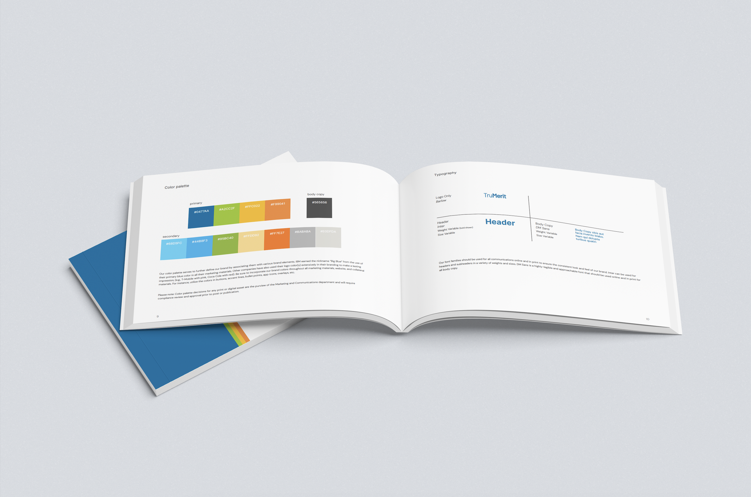
I also helped refine the color palette, typography system, and visual style to balance modernity with approachability. The logotype uses Barlow Regular and Semi Bold to emphasize “Tru” and “Merit,” reinforcing the values behind the name. Paired with the tagline “Global careers. Care anywhere.” the refreshed identity clearly communicates TruMerit’s mission and global impact.
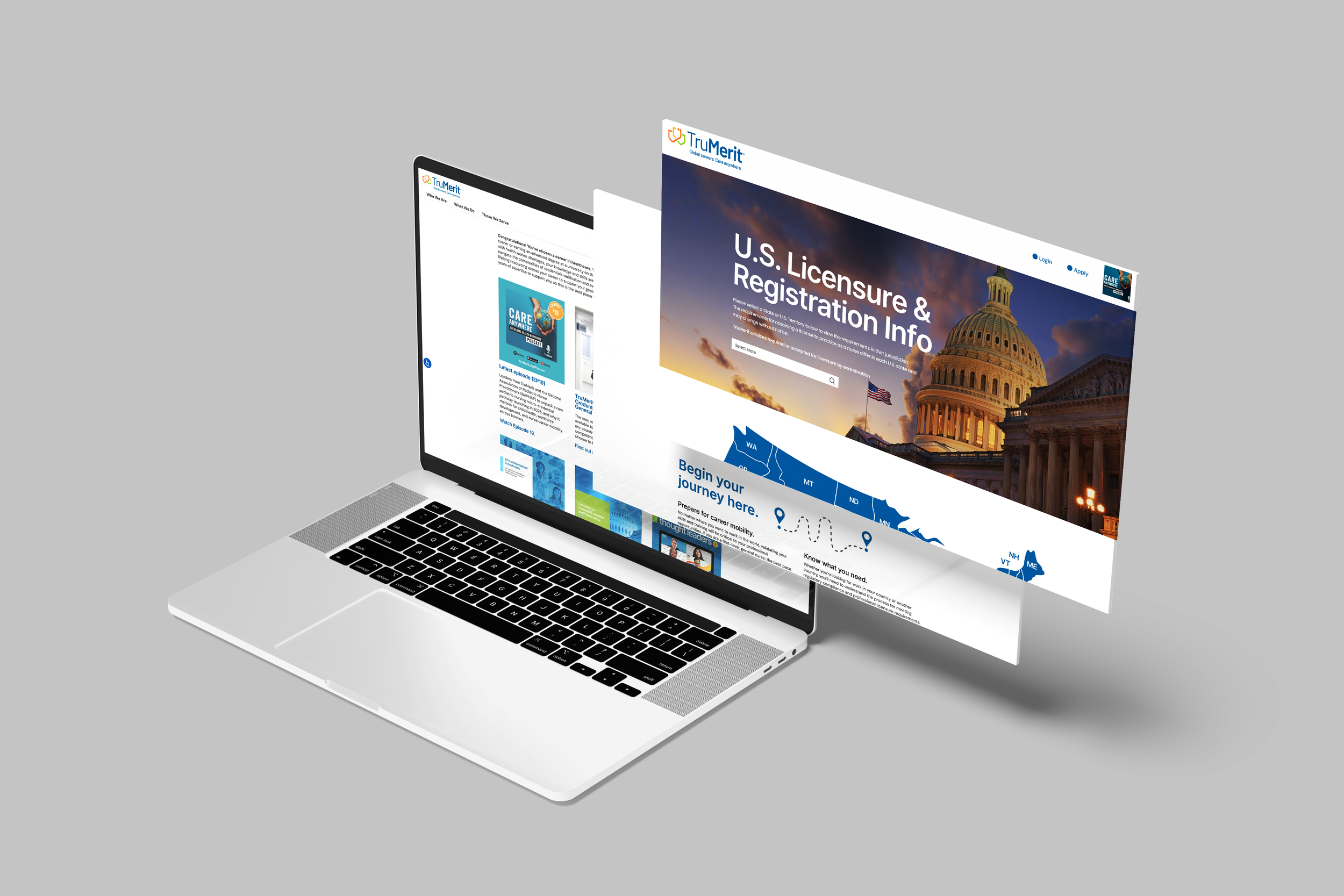
The project resulted in a cohesive brand system that works across digital platforms, print materials, social media, and environmental design, giving TruMerit a consistent and approachable presence for both domestic and international audiences.