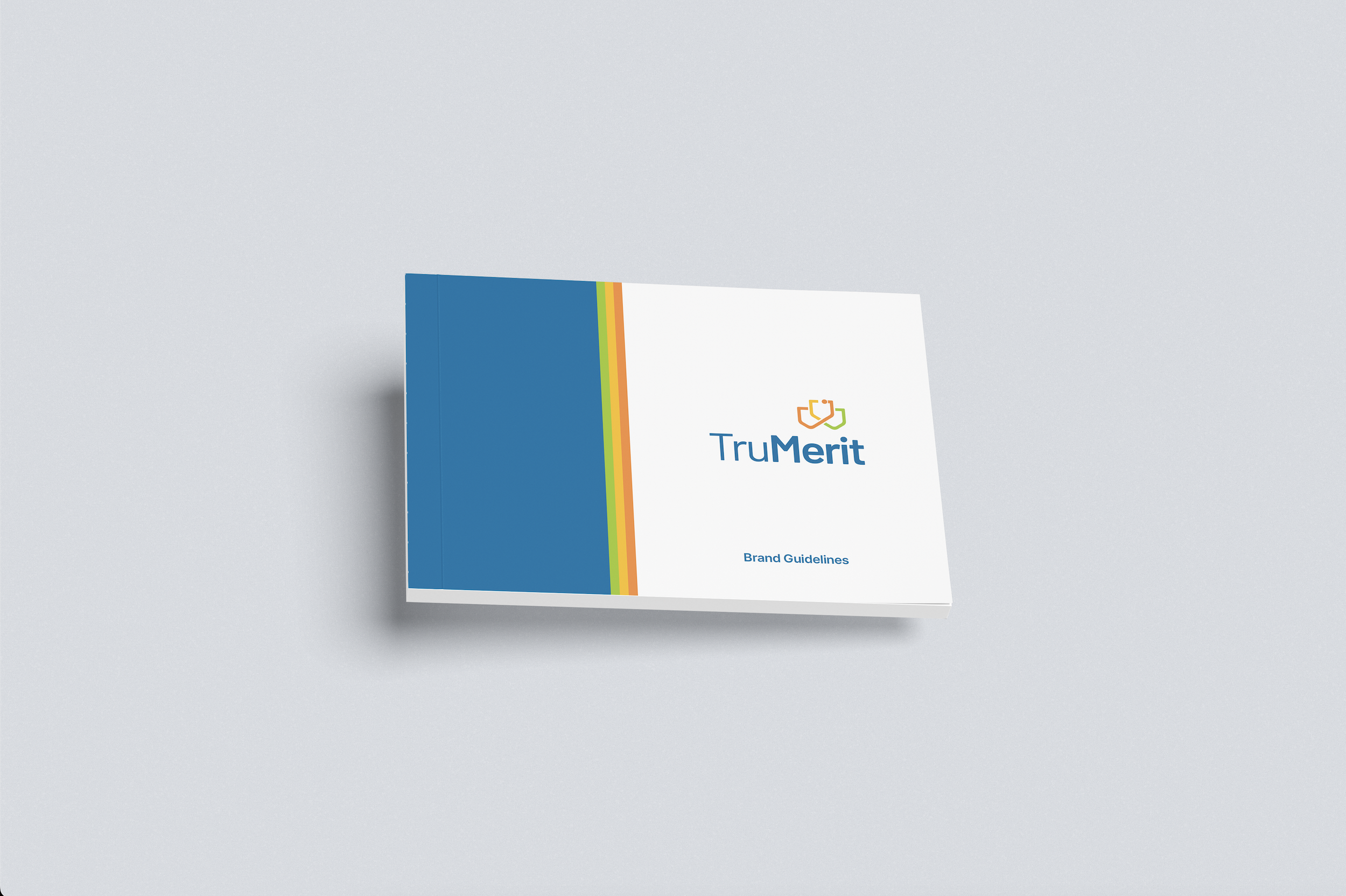
TruMerit Logo Redesign & Rebrand
The Problem
After nearly 50 years, the CGFNS International brand was starting to feel dated and no longer reflected the organization as it exists today or the global audience it supports.
The Work
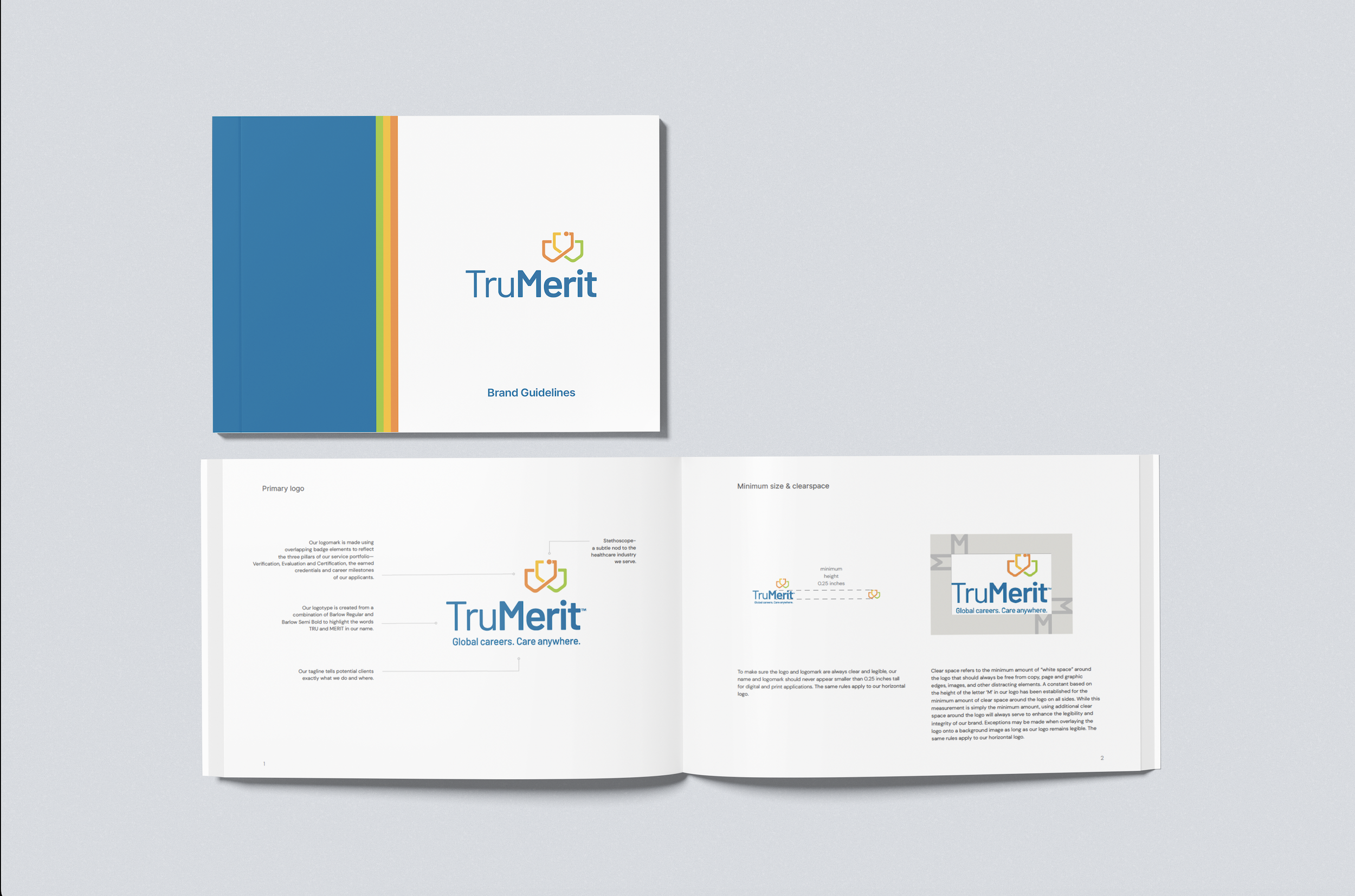
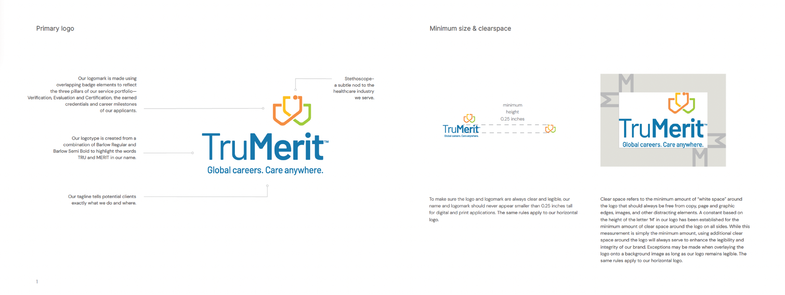
The goal of the rebrand was to create an identity that actually reflects the organization’s purpose and the people it serves. I worked on the logo and overall visual identity, creating a mark that feels modern while staying connected to healthcare professionals. The updated system brings a more confident and human tone to the brand.
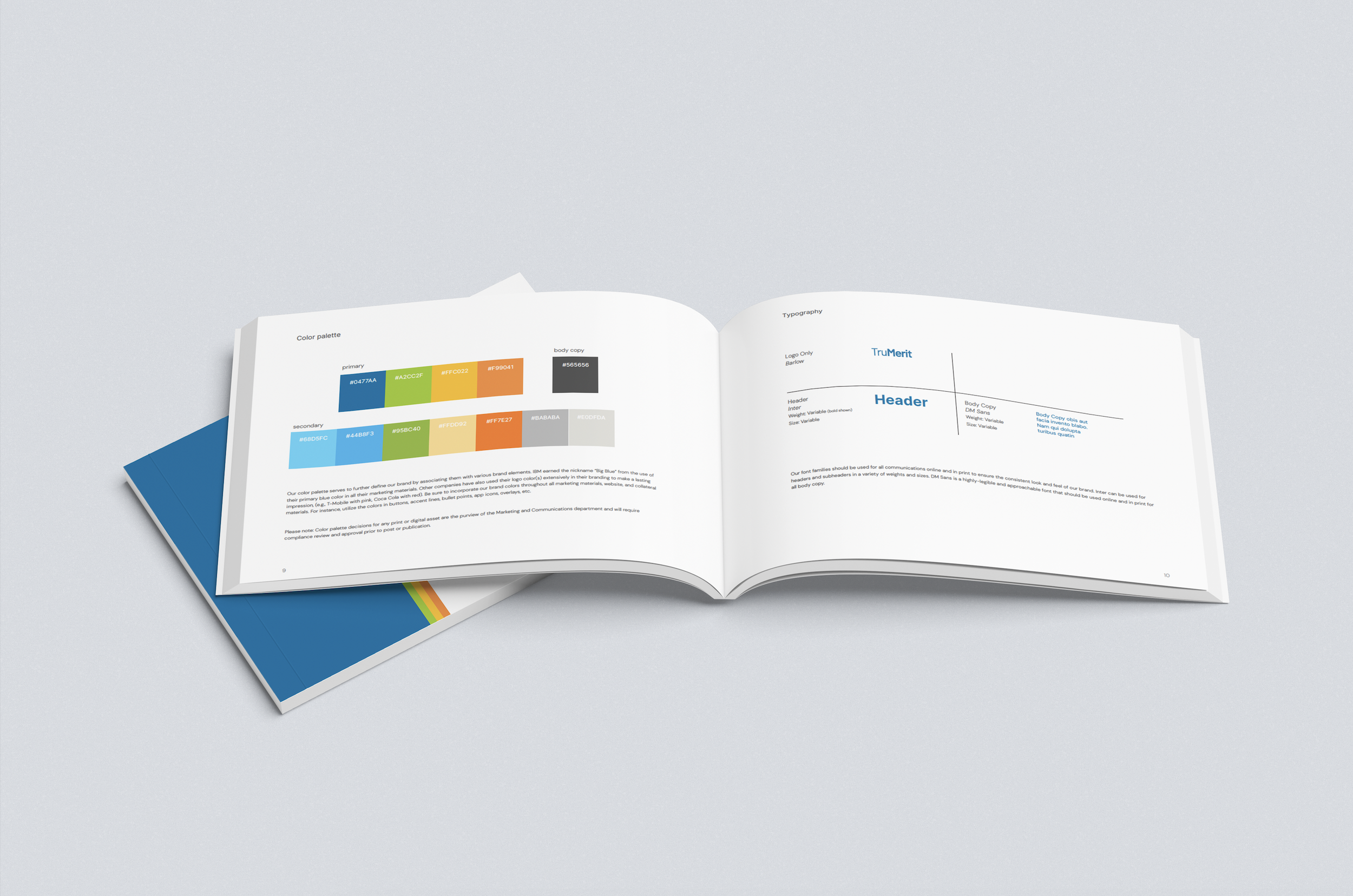
I also helped refine the color palette, typography, and visual style, making sure the identity works consistently across digital, print, and social. The result is a cohesive system that gives TruMerit a clear and recognizable presence.


Early Logo Design Concepts
Early logo and naming concepts from the TruMerit rebrand, showing initial directions explored during the transition from CGFNS International.